


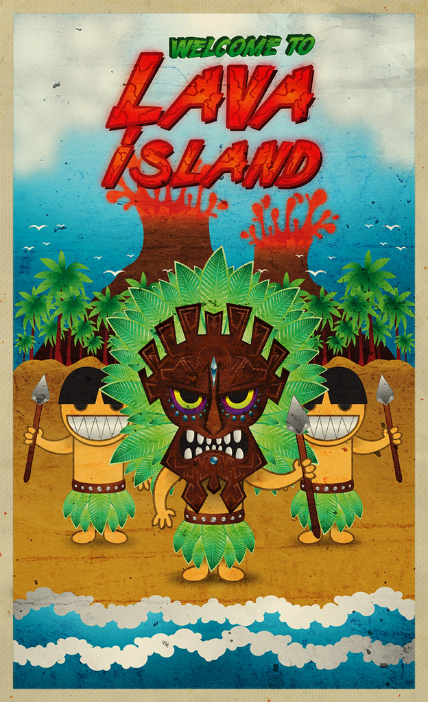
source : Abduzeedo

For this week tutorial I got inspired on the Tiki and Maori culture and made this big illustration. Tiki refers to large wood and stone carvings of humanoid forms in Central Eastern Polynesian cultures of the Pacific Ocean. The term is also used in M?ori mythology where Tiki is the first man, created by either Tumatauenga or Tane. ( Wikipedia ).
This is a advanced tutorial, however with you're a illustrator beginner you won't find bigger problems to do it, since I tried to explain it the best way possible, enjoy it guys :) .
Step 1
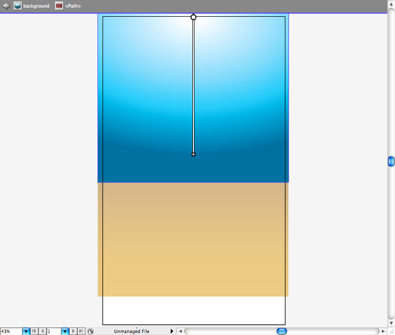
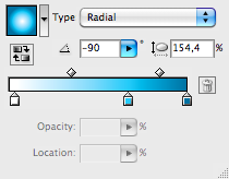
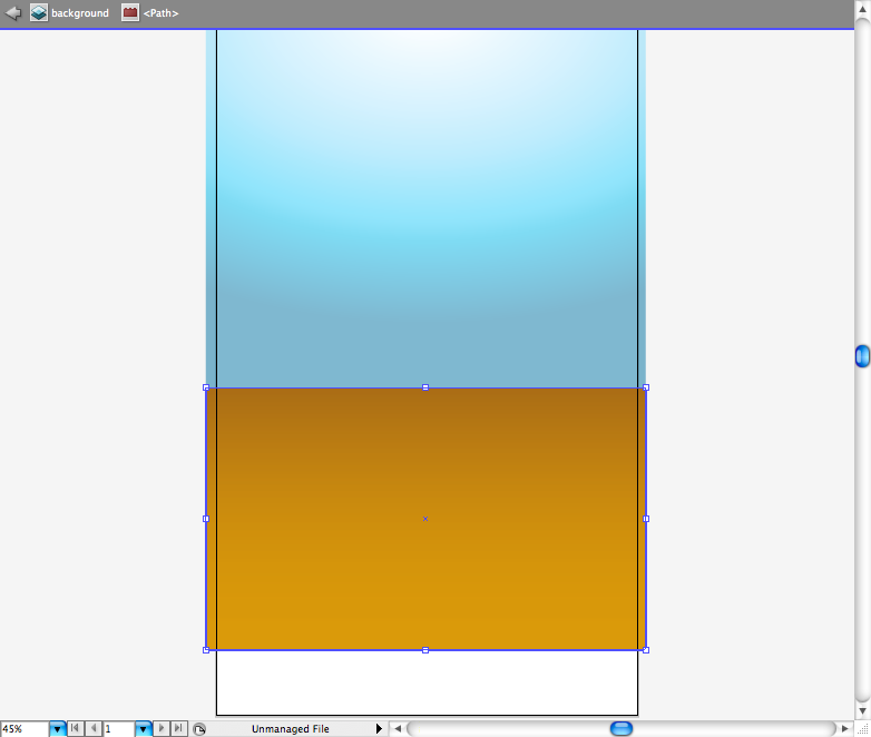
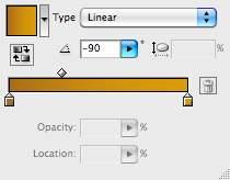
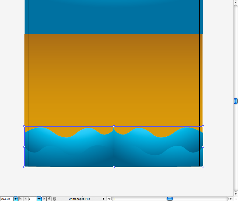
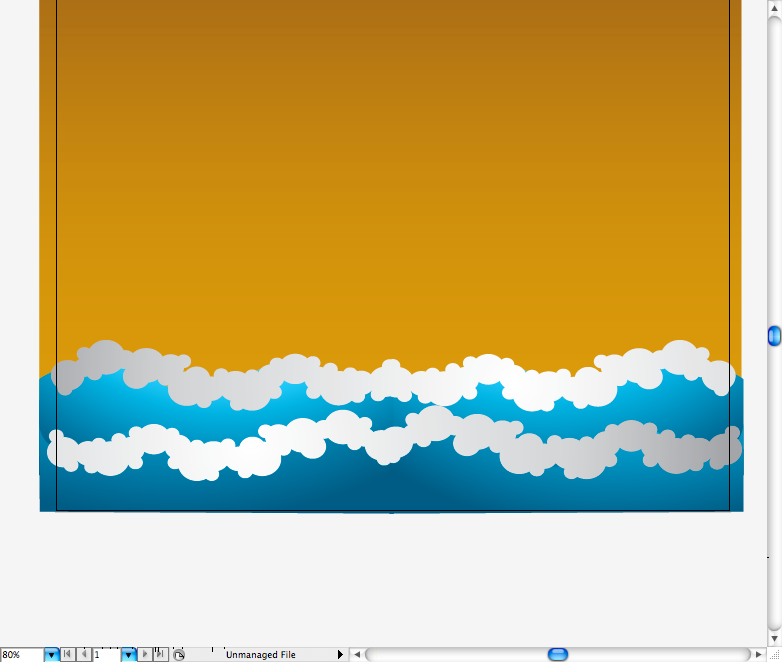
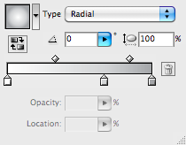
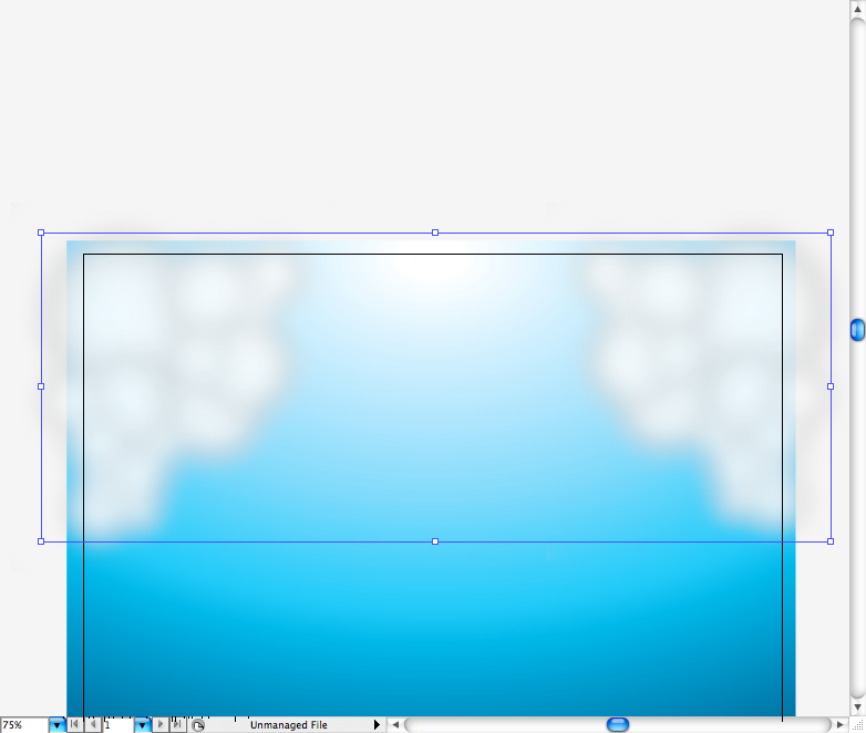
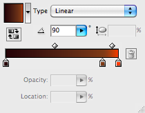
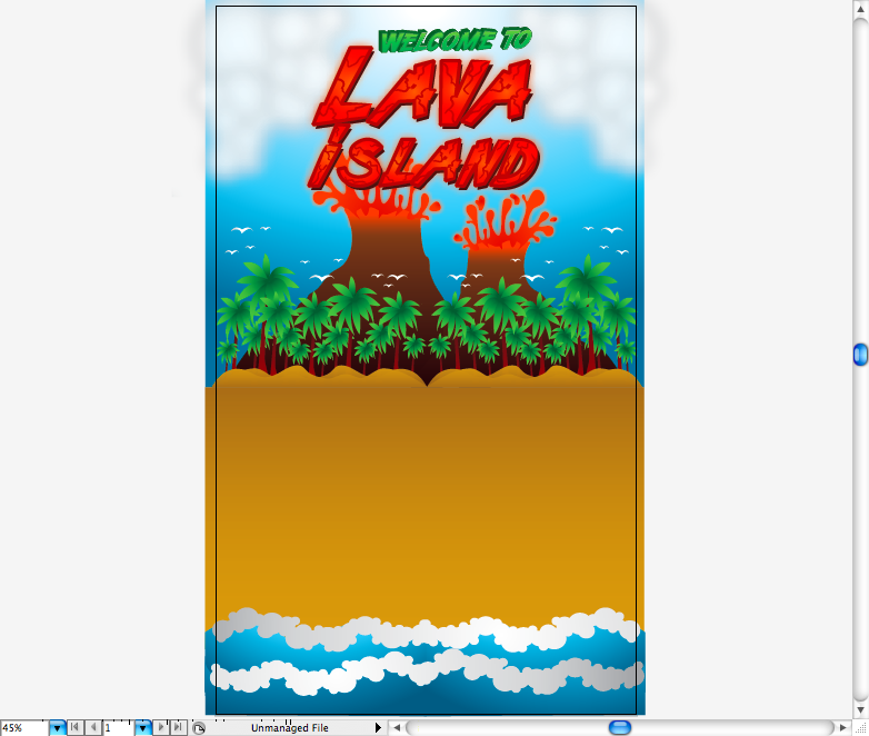
First of all, open Adobe Illustrator and create a 29,7 x 50 cm ( 11,69 x 19,68 inches) canvas, let's try to use a different canvas this time. Lets begin with the background, using the rectangle tool ( M ) create two rectangles that almost fit like 50/50 of the page, let a small space at the bottom, we're going to make the waves there. Then using the gradient tool ( G ) create a radial blue gradient for the upper rectangle and create a linear dark yellow gradient for the lower rectangle.
Step 2
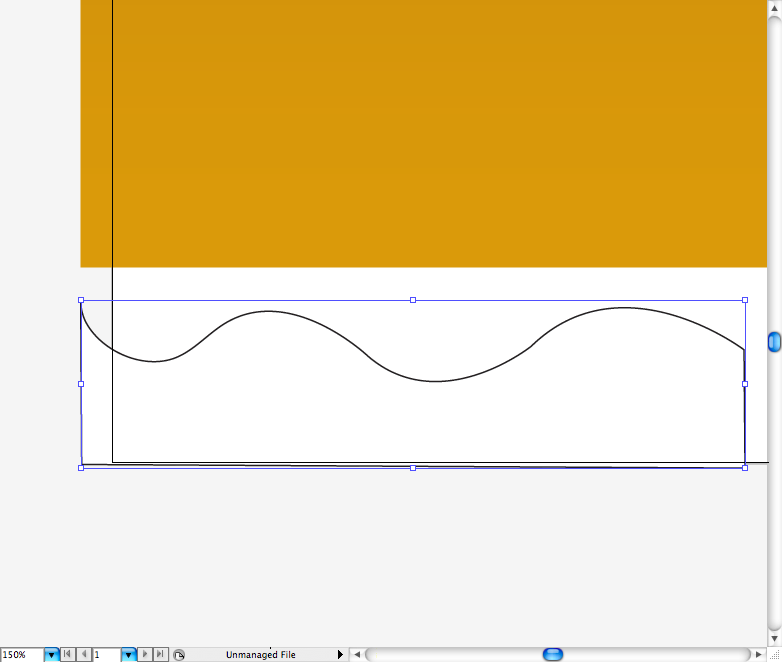
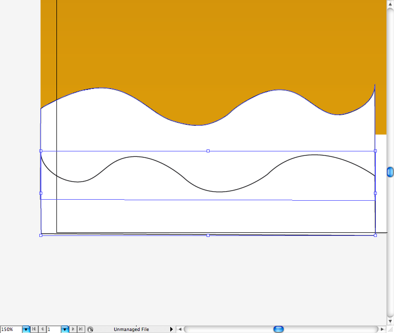
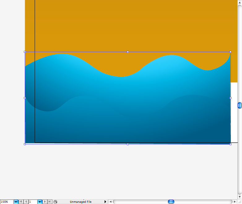
Using the pen tool ( P ) create this simply wave shape, duplicate it using the selection tool ( V ) + alt and then reflect it. Now copy the same gradient used in the sky using the eyedropper tool ( I ), just adjust the intensity and range of it. Again, duplicate the waves using the selection tool ( V ) + alt and then reflect it.
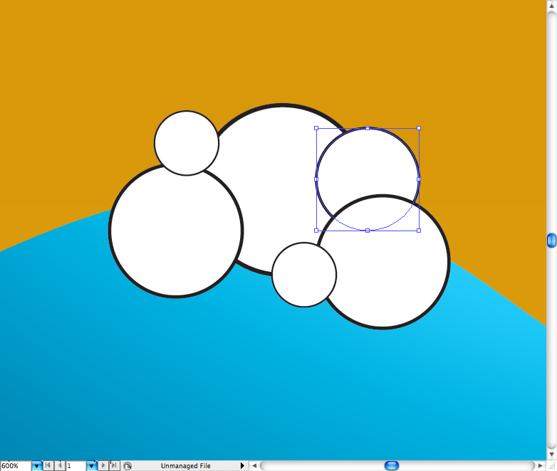
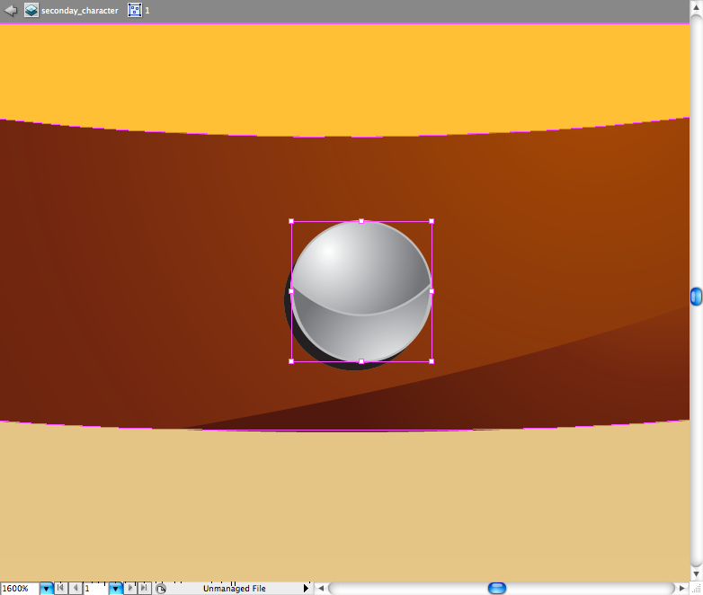
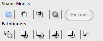
Creating the bubbles: Using the ellipse tool ( L ) create circles in different sizes, put them all together along the wave line. Select all of them using the selection tool ( V ) and access the pathfinder panel and choose the option called Unite. This will turn all into one path, duplicate it using the selection tool ( V ) + alt and add a light grey gradient using the gradient tool ( G ).

Step 3
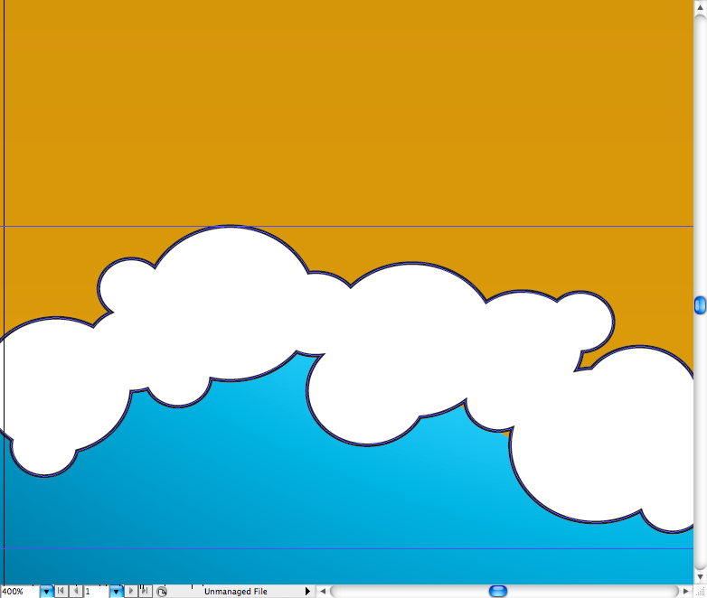
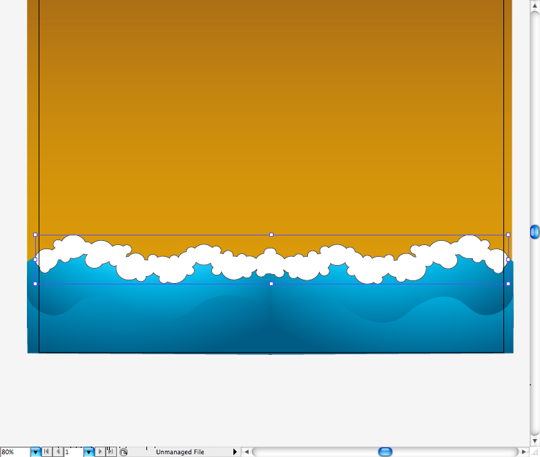
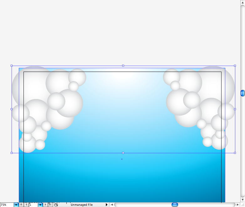
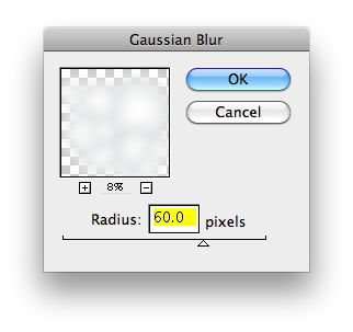
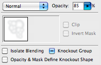
Let's repeat the same procedure of the bubbles to create the clouds, but this time use a radial gradient on the circles and don't use the pathfinder tool. Go to Effect > Blur > Gaussian Blur and set radius to 60 pixels. Go to the Transparency panel and set Opacity to 85% percent, you should get something like these.
Step 4
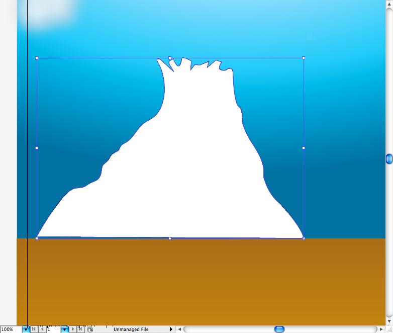
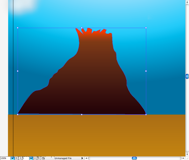
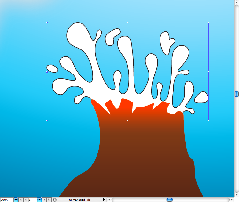
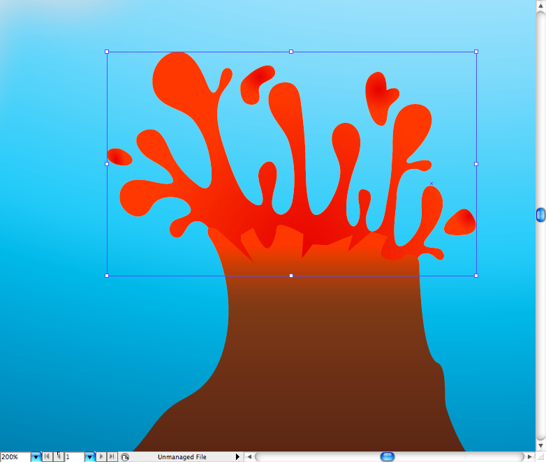
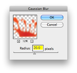
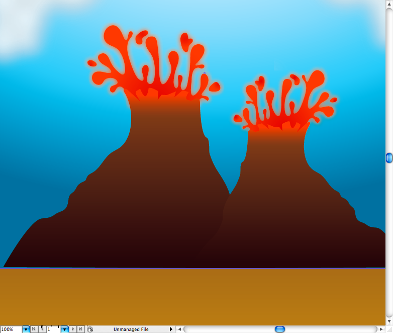
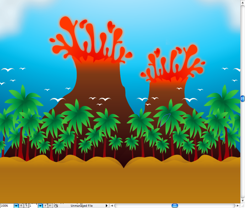
Let's create the volcanoes, using the pen tool ( P ) make this mountain shape, then use brown to orange linear gradient, using the gradient tool ( G ) adjust it making only part of the top orange. Again, using the pen tool ( P ) make the lava exploding out of the vulcano, add a strong red gradient to it. Duplicate the lava using the selection tool ( V ) + alt and go to Effect > Blur > Gaussian Blur and set radius to 20 pixels. Then, just duplicate the whole vulcano, resize and place it on the other size.
Step 5
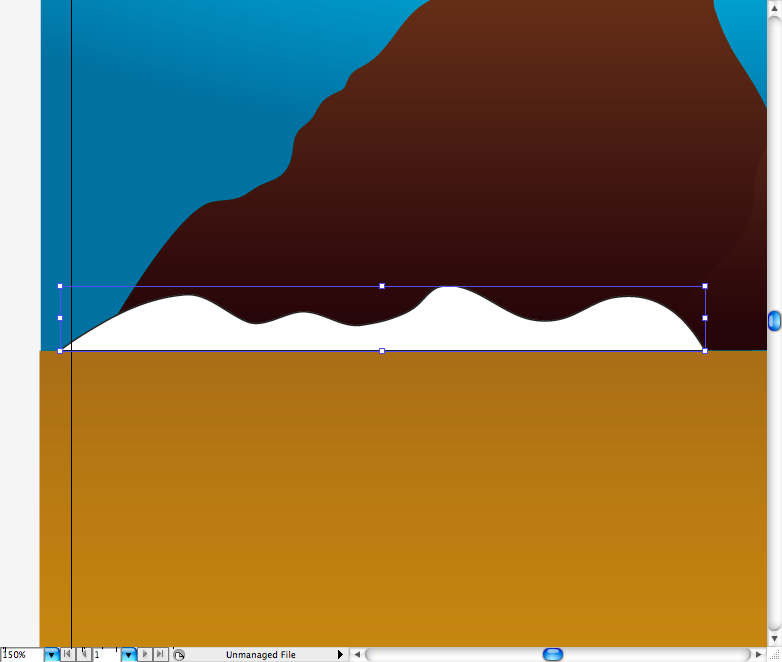
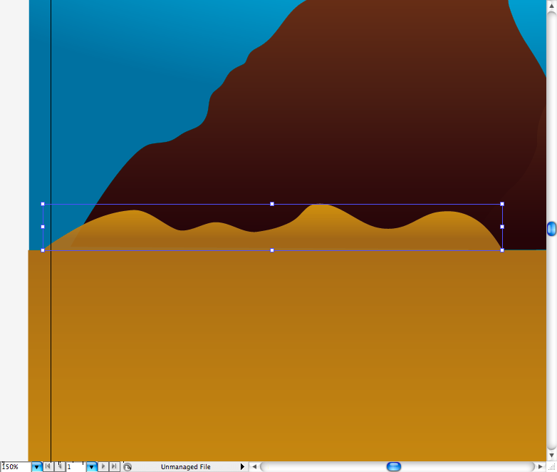
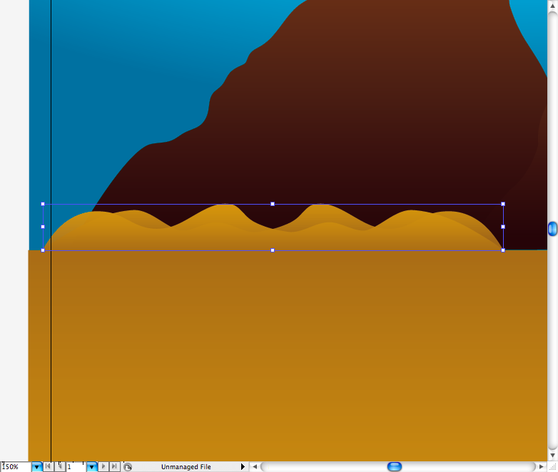
Making the dunes: using the pen tool ( P ) create this dune silhouette, add the same gradient used on the rectangle bellow by using the eyedropper tool ( I ). Duplicate it using the selection tool ( V ) + alt and reflect it.
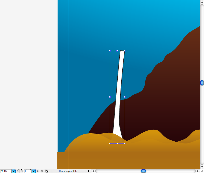
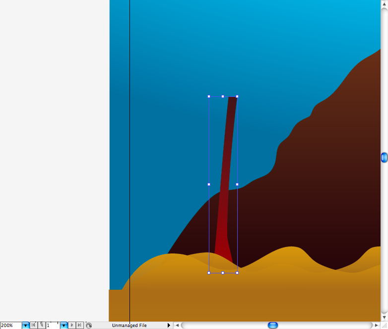
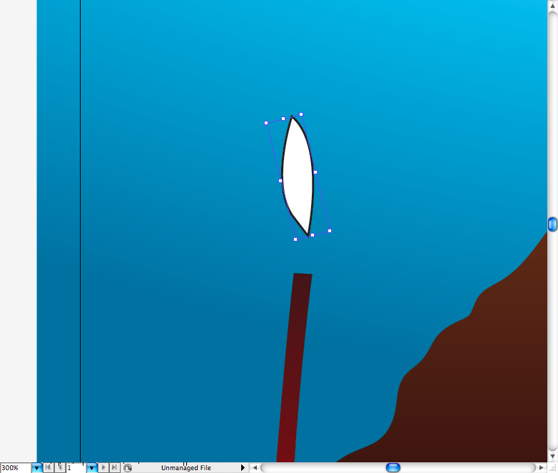
The first part of the part of the palm tree to be created is the trunk, draw a shape like this using the pen tool ( P ) then add a brown gradient to it. Use again the pen tool ( P ) to create the leaves, duplicate them and place them around the trunk top, using the gradient tool ( G ) add a green gradient to them. Group all this elements (ctrl + G / command + G ) and duplicate the palm tree using the selection tool ( V ) + alt till you got pretty much a forest.

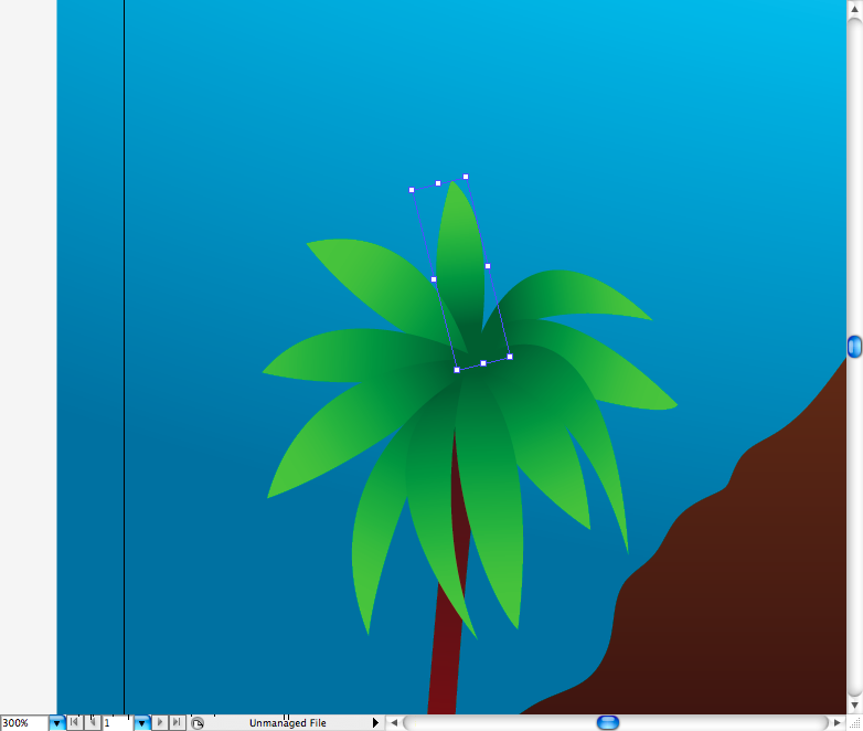
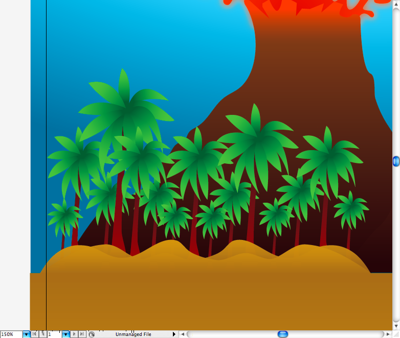
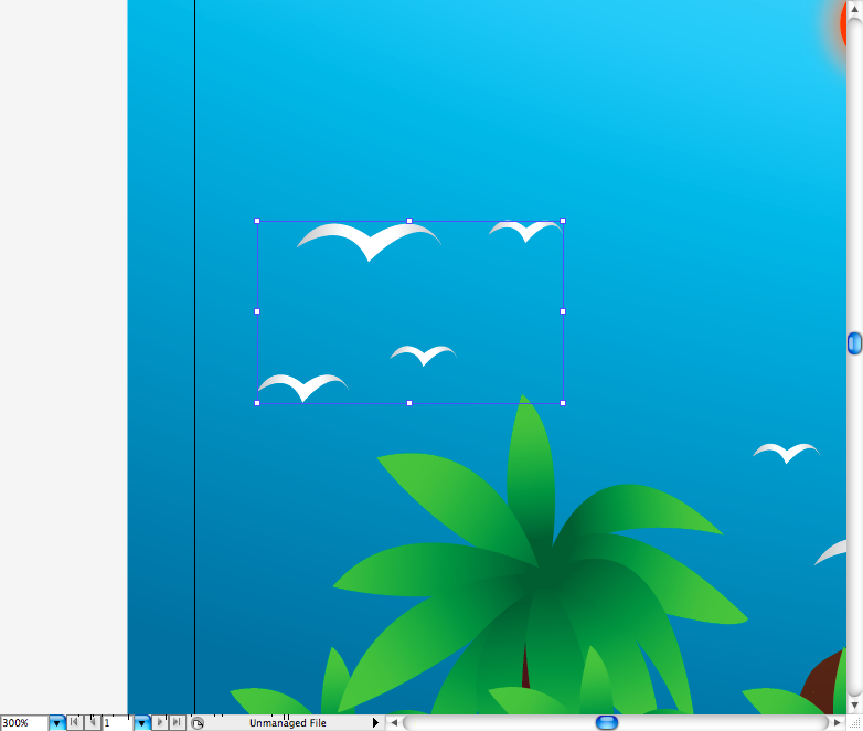
I also drawed this classic "M" shaped birds using the pen tool ( P ) and distributed them along the top of the palms. Finally, group (ctrl + G / command + G ) , duplicate using the selection tool ( V ) + alt and place these elements on the other side. The background is done.
Step 6
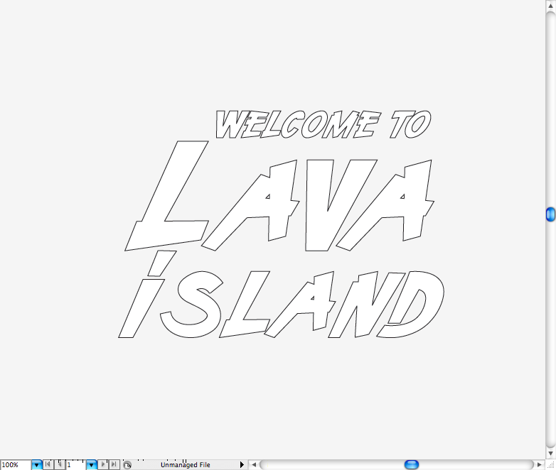
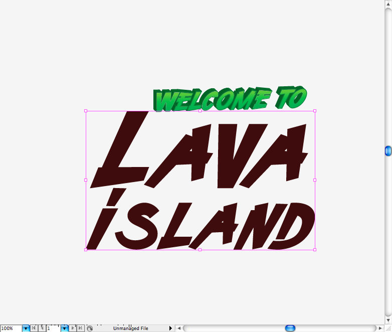
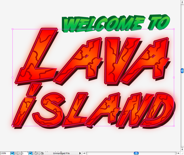
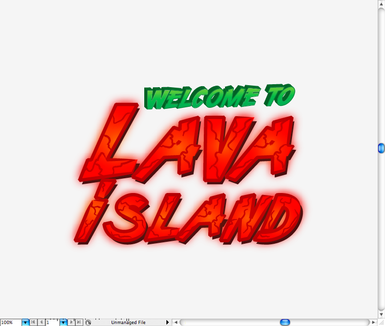
For the title I used the Demon Racer font, you can grab it at Legacy of Defeat , there's a bunch of nice free fonts designed by Hydro 74 there. Well, using the text tool ( T ) type "Welcome to", make another text box with a bigger font size and type "Lava Island" in two lines. You will probably have to adjust the kerning beetween the letters, after that transform all in outlines.
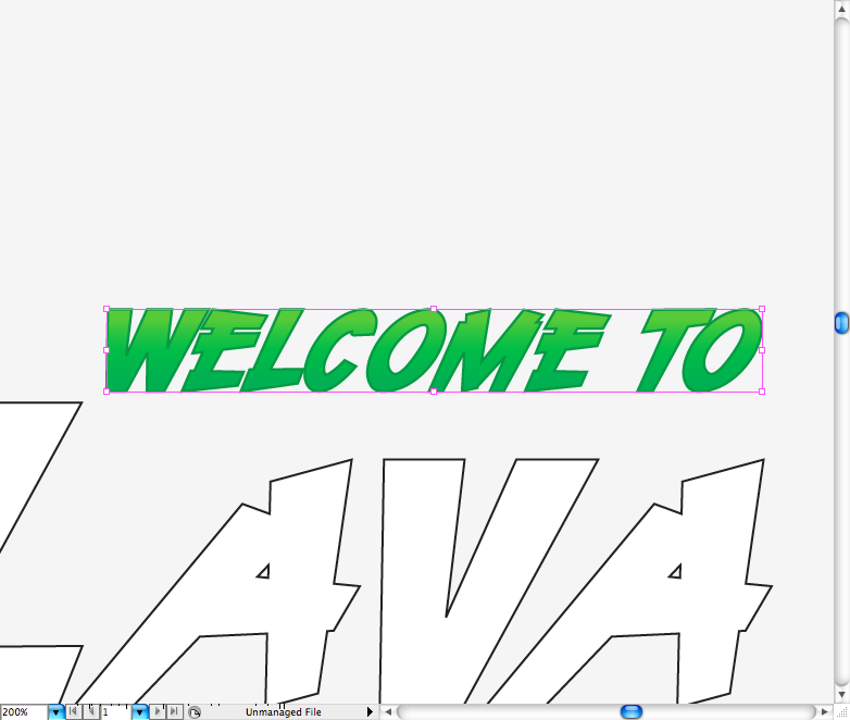
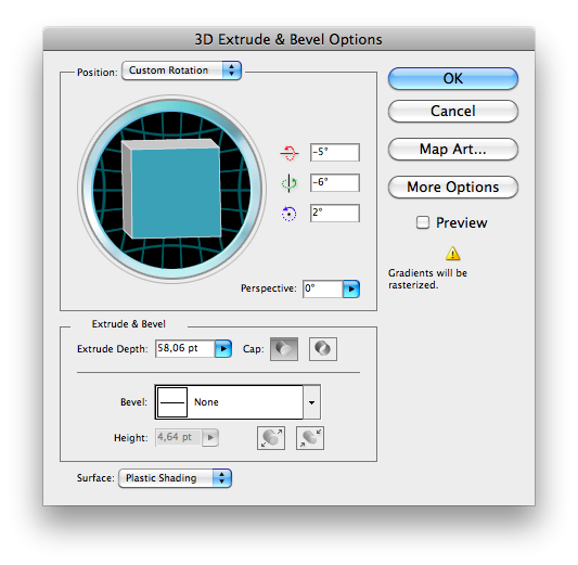
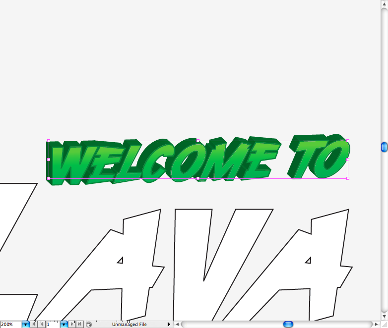
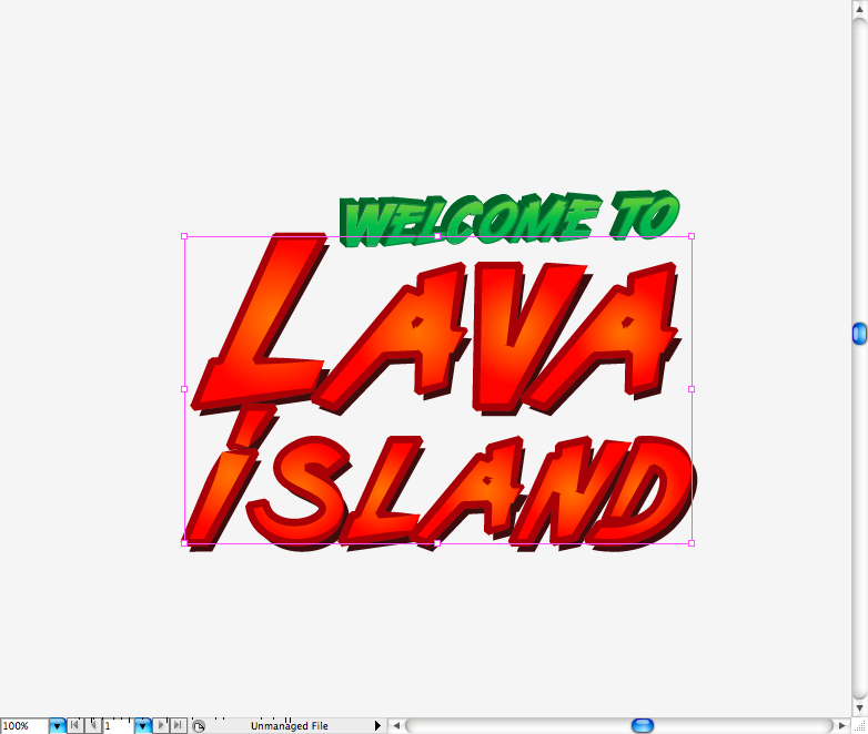
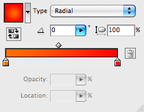
Get the "Welcome to" and add a green linear gradient to it, also add a green stroke to it. Then go to Effect > 3D > Extrude and Bevel set the parameters like the image bellow. You should get something like these.
Now turn the "lava island" fill into brown and then duplicate it using the selection tool ( V ) + alt. Add a radial red gradient to it then using the brush tool ( B ) and a 1 pt charchoal brush, makes this cracks inside the letters.
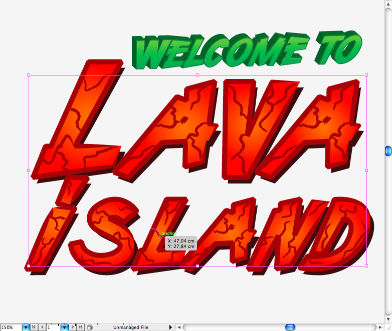
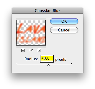
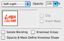
Duplicate only the letters and access Effect > Blur > Gaussian Blur and set radius to 40 pixels. Place this one on the back of the letter, duplicate this blurred layer and place it on the top, access the Transparency panel and choose the blending mode called Soft light. Place the title at the top of the illustration.
Step 7
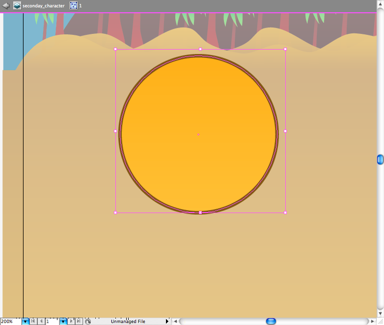
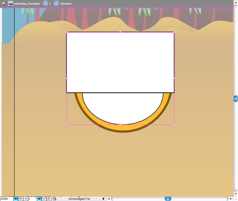
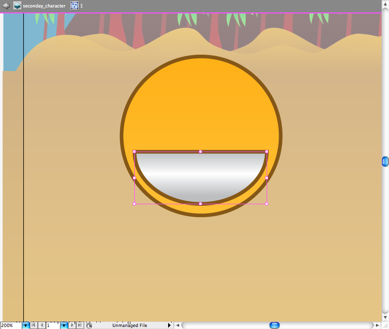
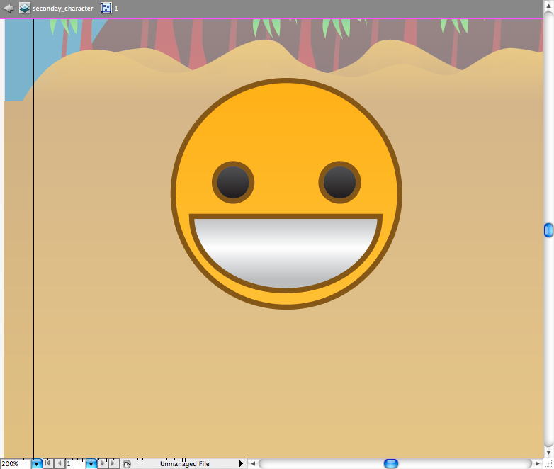
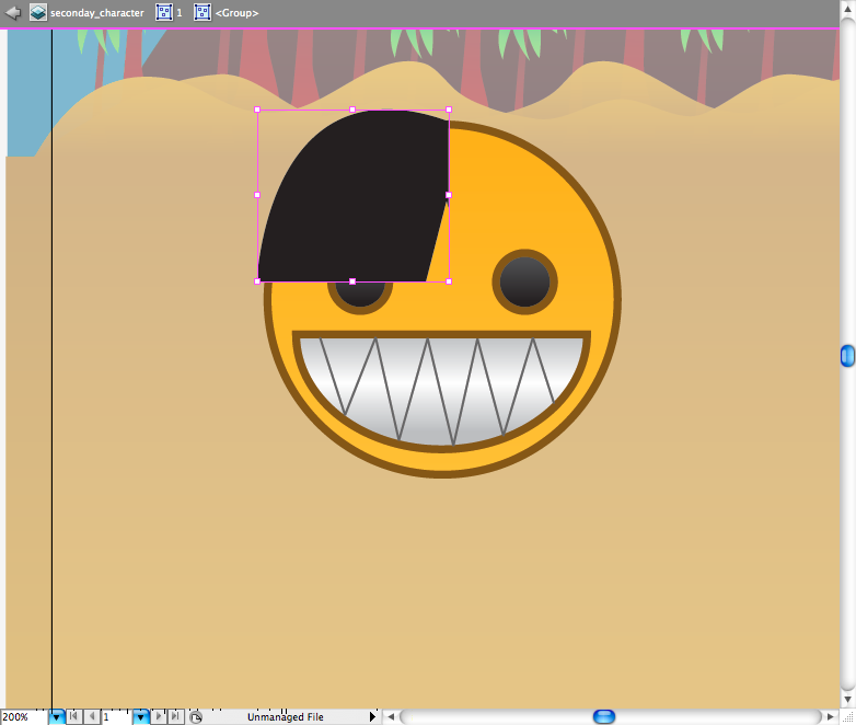
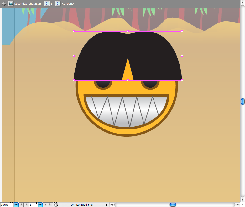
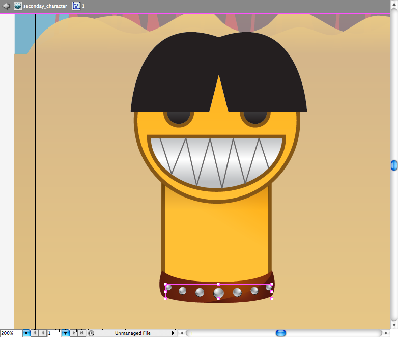
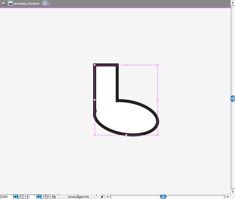
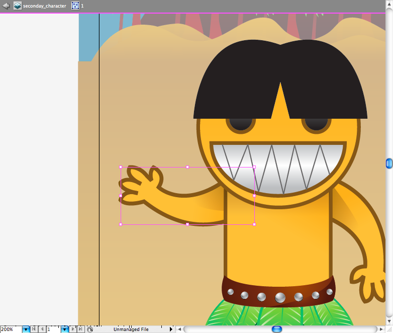
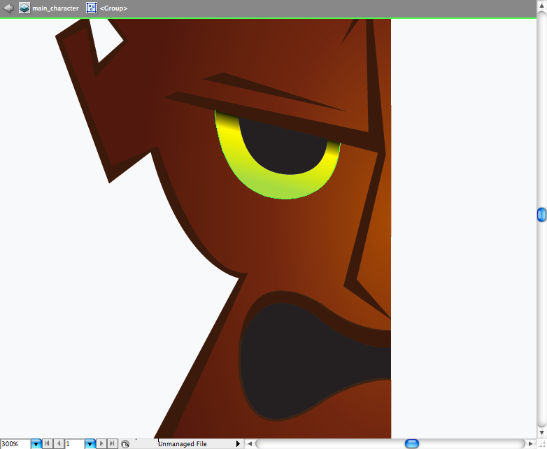
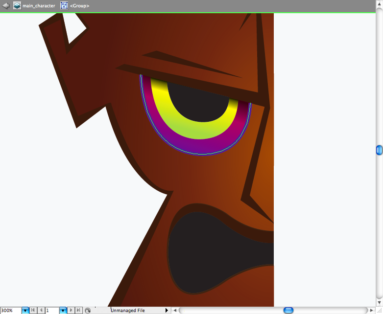
So let's skip to the characters, first using the ellipse tool ( L ) create this circle with a brown stroke and a dark yellow gradient fill. Then again use the ellipse tool ( L ) create another circles and using the rectangle tool ( M ) create a rectangle on the top of it, access the pathfinder panel and choose the option called Minus front. You should get a semi circle, add a light linear grey gradient to it. The eyes are just to circles with a grey gradient fill and brown stroke, create them using the ellipse tool ( L ). Now using the pen tool ( P ) draw line inside the mouth to look like sharpy teeth. The hair can be done using the pen tool ( P ) and then duplicating and reflecting it.
Step 8
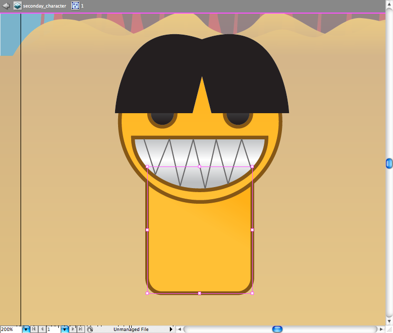
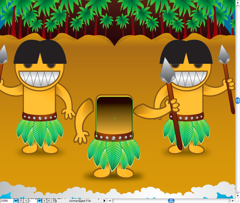
Well the body is quite simple, just use the round rectangle tool , then duplicate it and use a gradient with transparency.

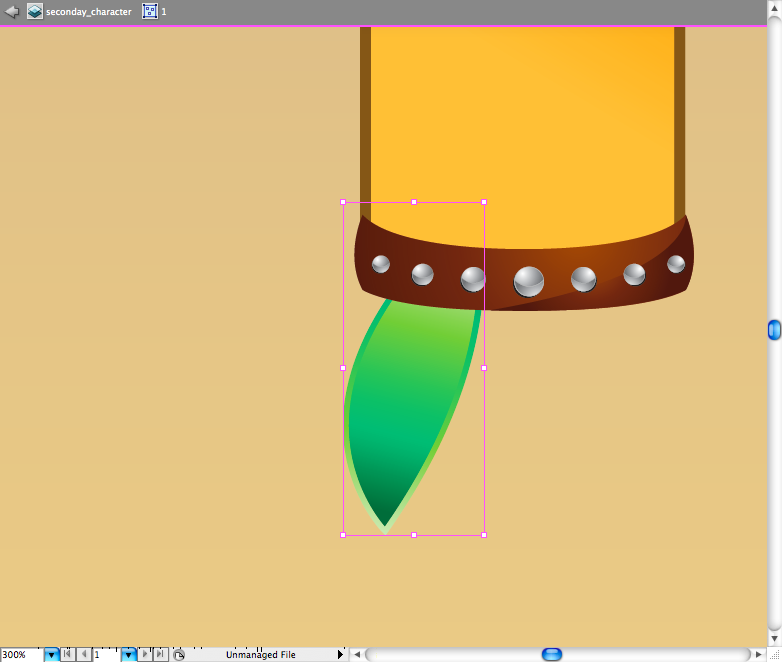
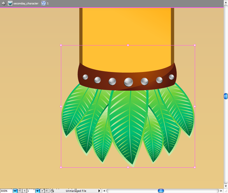
Draw the belt using the pen tool ( P ) , add a brown gradient to it. Let's just add a detail, using the pen tool ( P ) create this shadow and add the same gradient of the belt using the eyedropper tool ( I ).
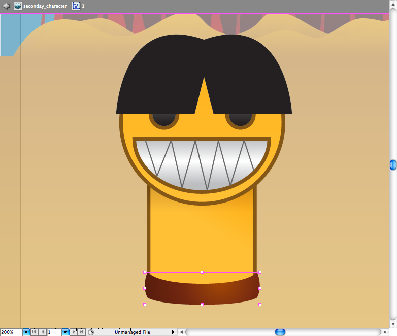
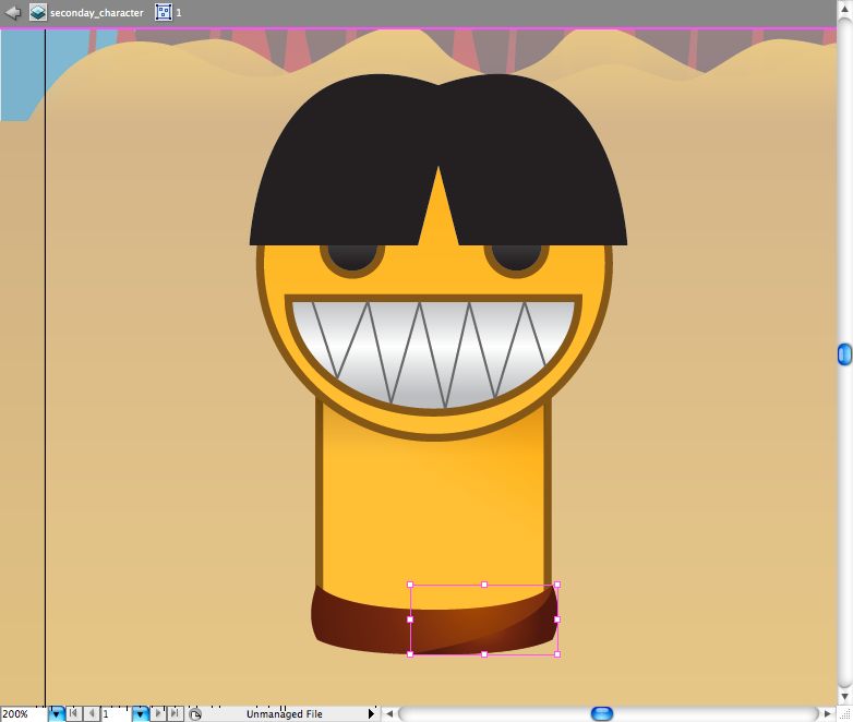
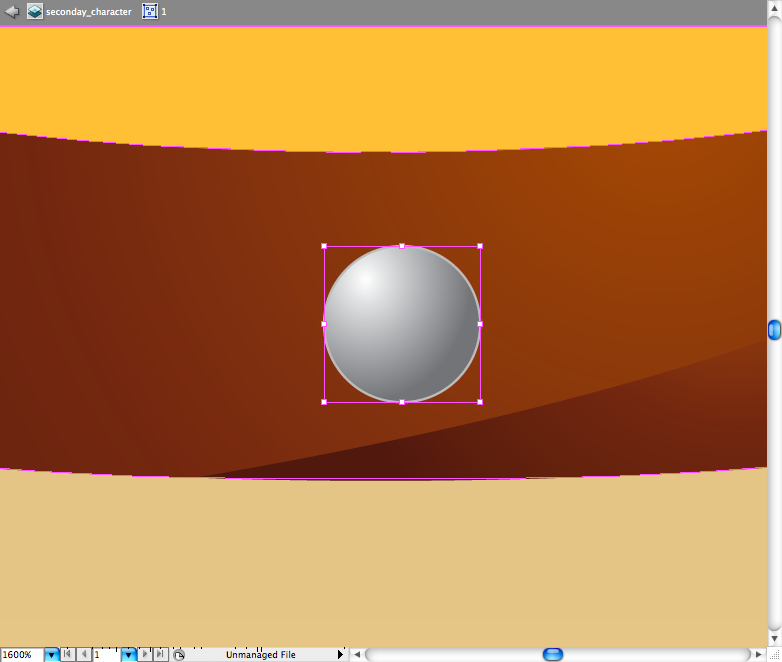
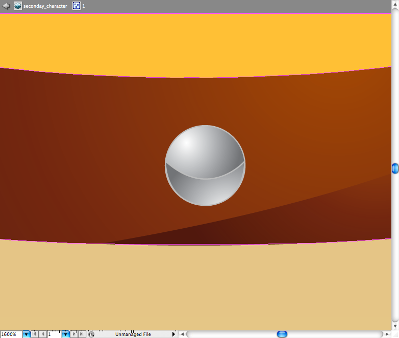
Lets make the shinning stones on the belt,pretty simple, just draw a circle using the ellipse tool ( L ), add a grey stroke and a grey gradient fill. Using the pen tool ( P ) draw this half moon on the top of the circle, copy the same gradient using the eyedropper tool ( I ). Make another circle behind with a black fill. Duplicate and distribute this stones around the belt, rezising it when needed.
Step 9
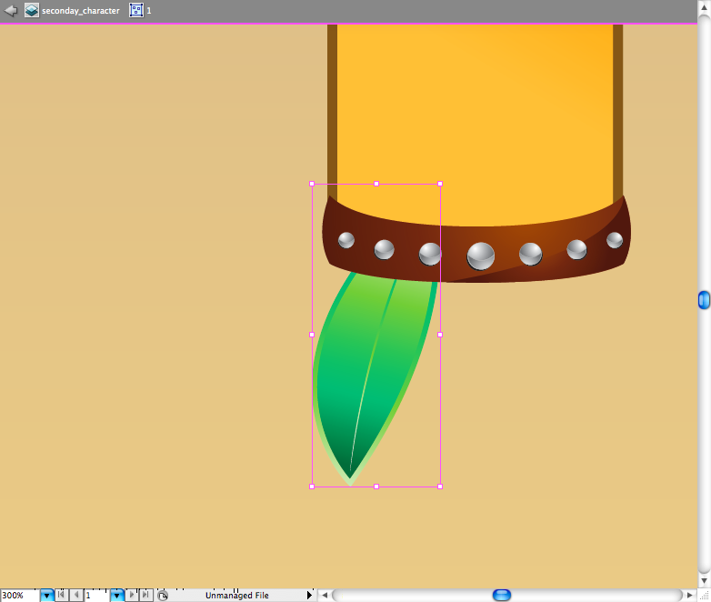
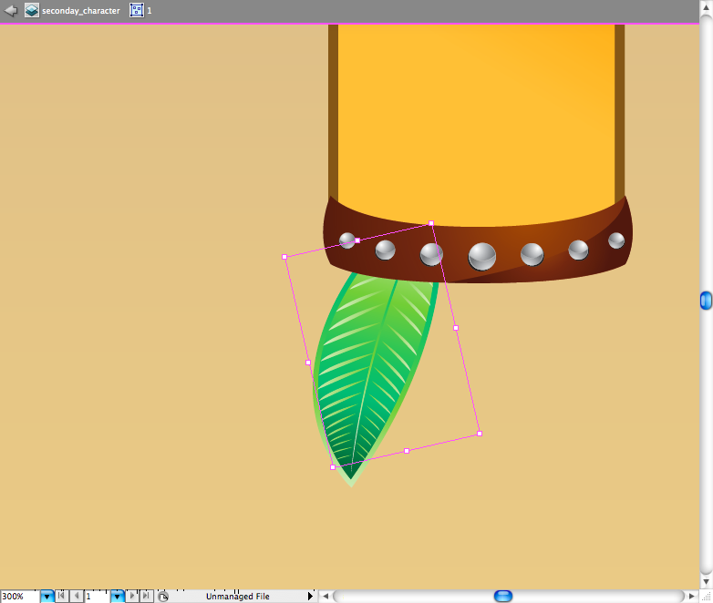
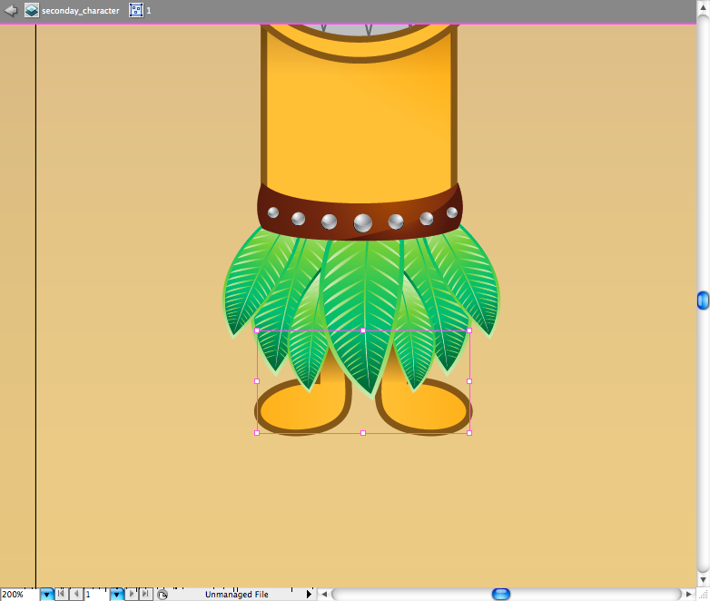
Now let's try to draw the leaves skirt, using the pen tool ( P ) draw this leaf shape, then add some green gradient anda green stroke to it. Using the pen tool ( P ) create all this lines and then put a gradient on it, I suggest you to first create the main line and then resize and duplicate it using the selection tool ( V ) + alt. Group ( ctrl + G / command + G ) all the elements of the leaf and duplicate and resize it till you got a skirt, this should take sometime.
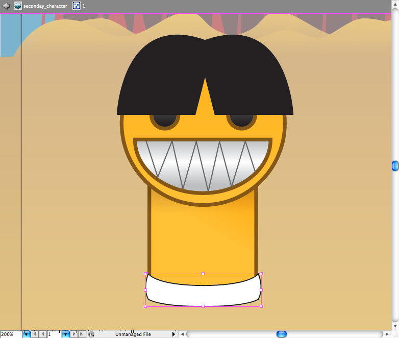
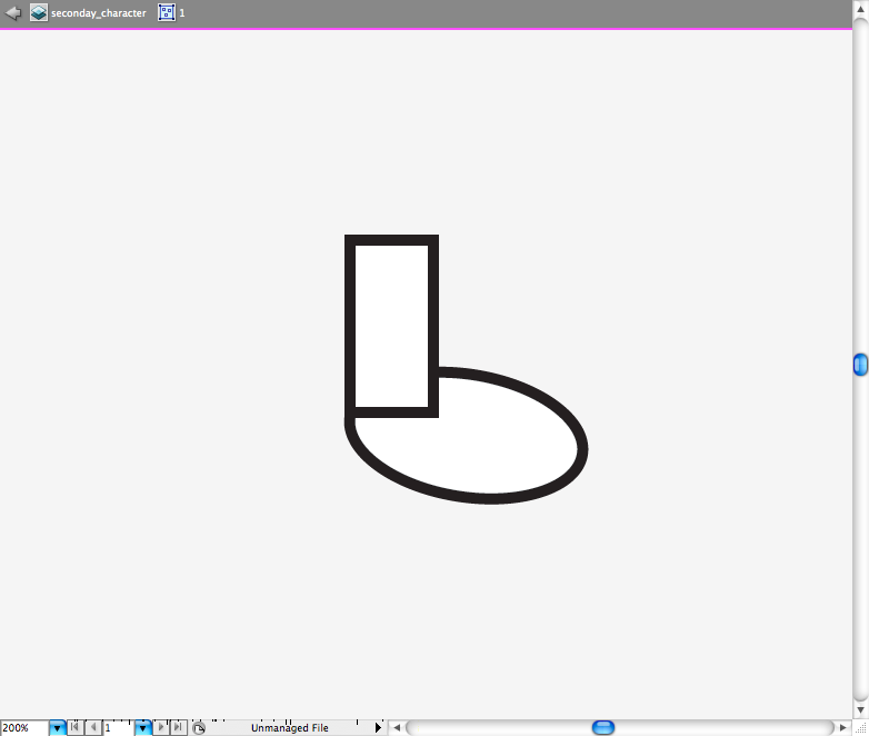
The easiest way to make a foot is to create a rectangle and a circle and posicionate them just like the image bellow, then access the pathfinder panel and choose the option called Unite. Duplicate the foot and put them above the leaves skirt.
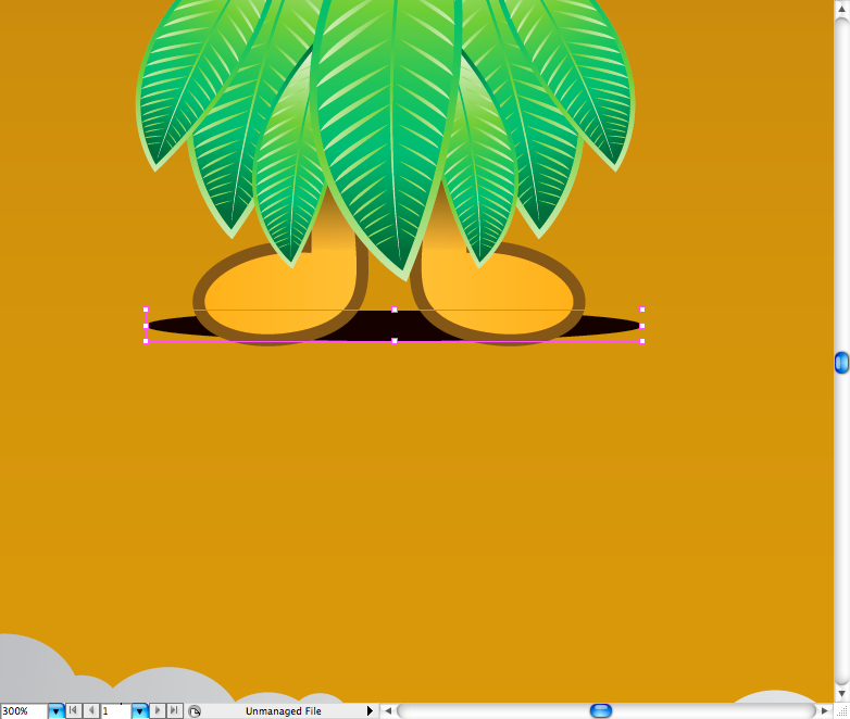
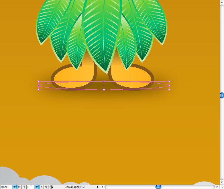
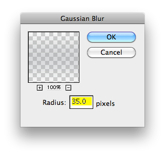
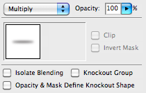
The shadow it's pretty easy to do, just make a circle using the ellipse tool ( L ) and then go to Effect > Blur > Gaussian Blur and set radius to 35 pixels. Access the Transparency panel and choose the blending mode called Multiply.
Step 10
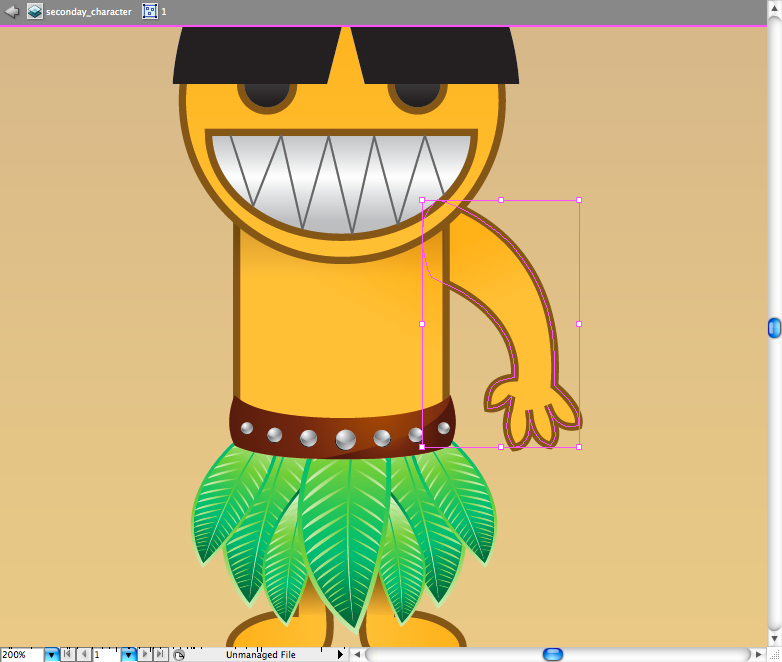
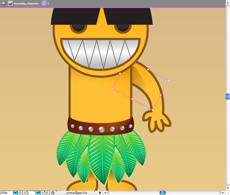
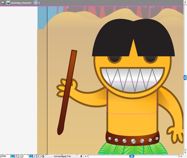
Well, I really don't know any shortcut to draw the arm, so you gonna have to try to draw it with the pen tool ( P ), I also drawed the shadow of the army on the same way. To make the left army I just copied and pasted the arm, then rotate it.
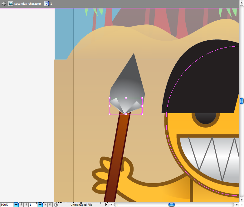
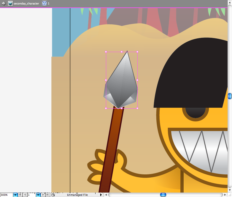
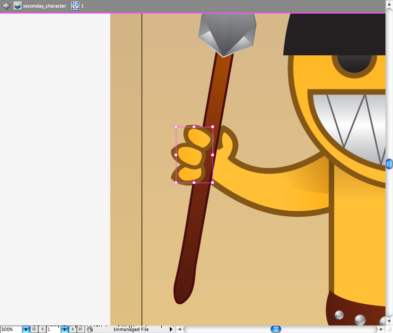
Making the spear was quite a experiment with gradients, first using the rectangle tool ( M ) I create the stick, use the pencil tool ( N ) to make the bottom of it round. I don't know exactly how to describe the process of making the stone of the spear, like I did a couple of grey gradients with the pen tool ( P ) and then adjust them with the gradient tool ( G ) till they it get some depth effect. But you can't let the spear floating so make some fingers using the ellipse tool ( L ) and adjusting it with the direct selection tool ( A ).

Step 11
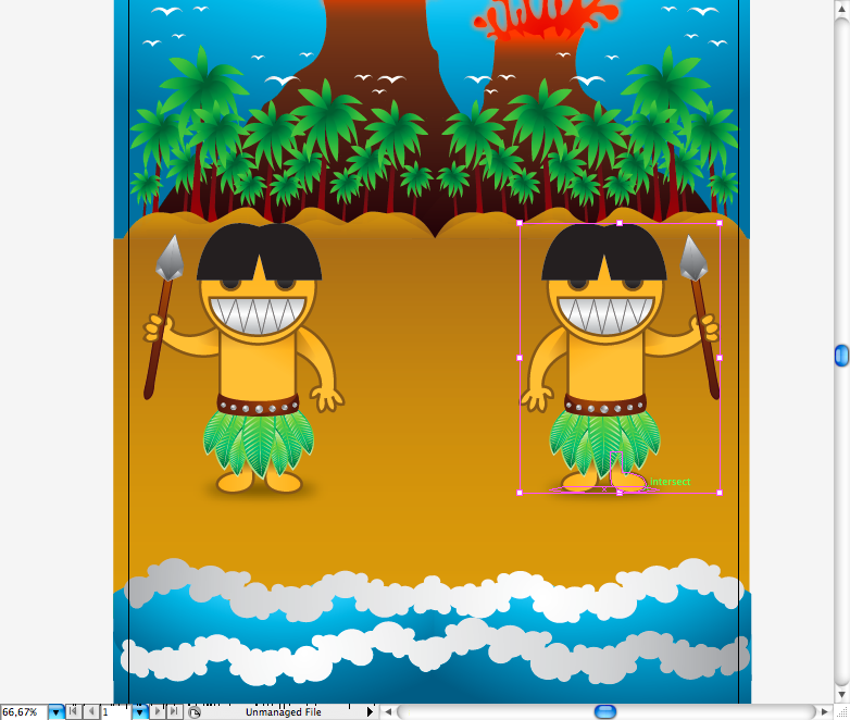
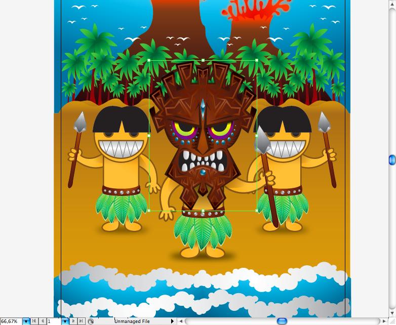
Now just copy and reflect the native to the other side using the selection tool ( V ), did the same thing for the main character, but put a bigger shadow on the body and put the arms more far from the body, because of the size of the mask we are going to do next.
Step 12
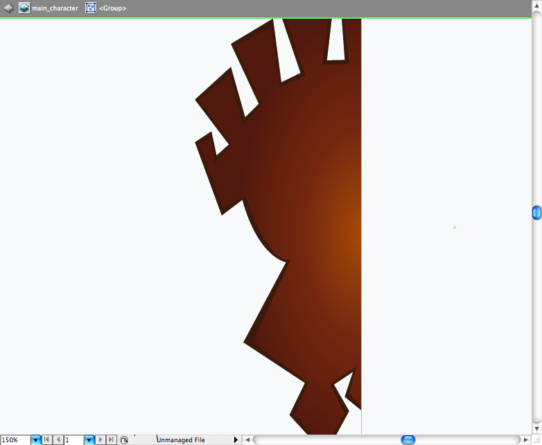
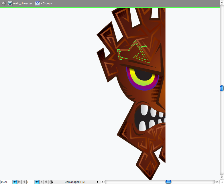
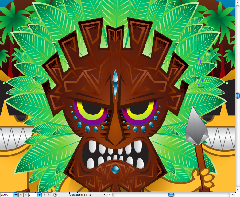
Well, sometime ago I did a tutorial of how to create a Hellboy Poster , if you already read it you will find this part a lot easier to do, if not I'd suggest you to read when you got the time. First we're going to draw the shape of the mask with the pen tool ( P ) , you don't have to draw the same shape as me, feel free to create your own version. Next I made the fill withe the pen tool ( P ) and added a radial brown gradient.
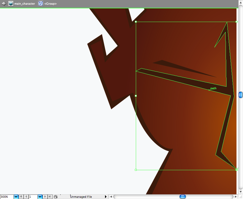
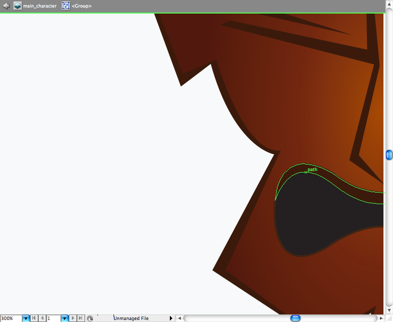
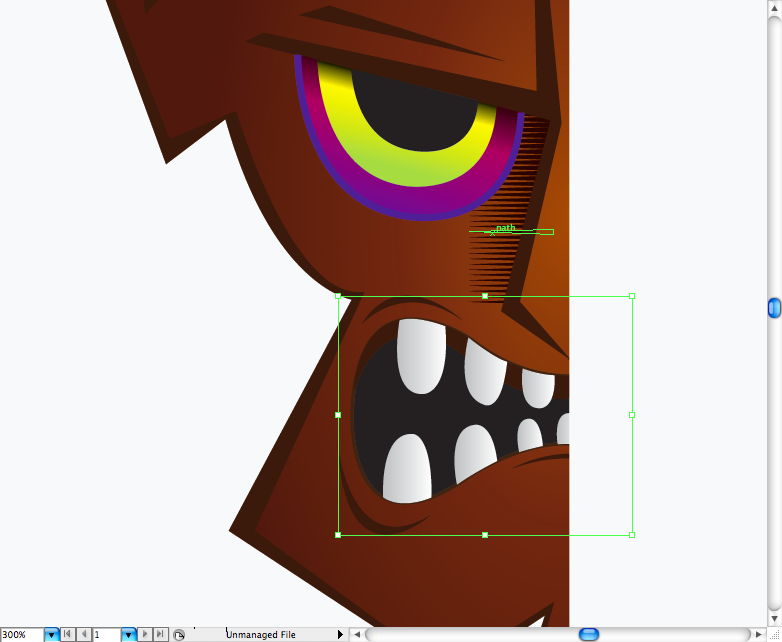
Again using the pen tool ( P ) , let's draw the nose and the eyebrown. Then, using the pen tool ( P ) let's draw the mouth hole and a brown shape to create depth.

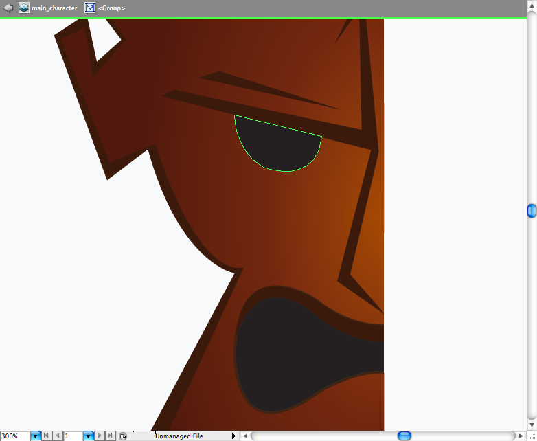
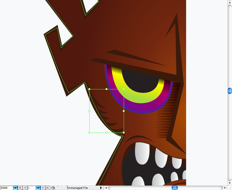
Remember the procedure we did to create the native mouth? Yep, that's pretty much this same step, but this time you will rotate and adjust it with the direct selection tool ( A ). Duplicate the eye and resize it using the selection tool ( V ) , choose a yellow gradient with a bit of black on it, adjust using the gradient tool ( G ) so it get on the top next to the eyebrown. Repeat this procedure but this time use a purple/pink gradient with a purple stroke, adjust till you get some depth.
This is another nice trick: make a series of triangles, the easiest way is to make it with the pen tool ( P ) and them duplicate it many times. Posicionate it next to the nose to make the shading, then again with the pen tool ( P ) trace the area you want the shade to appear, select all the triangles and make a clipping mask ( ctrl + 7 / command + 7 ).
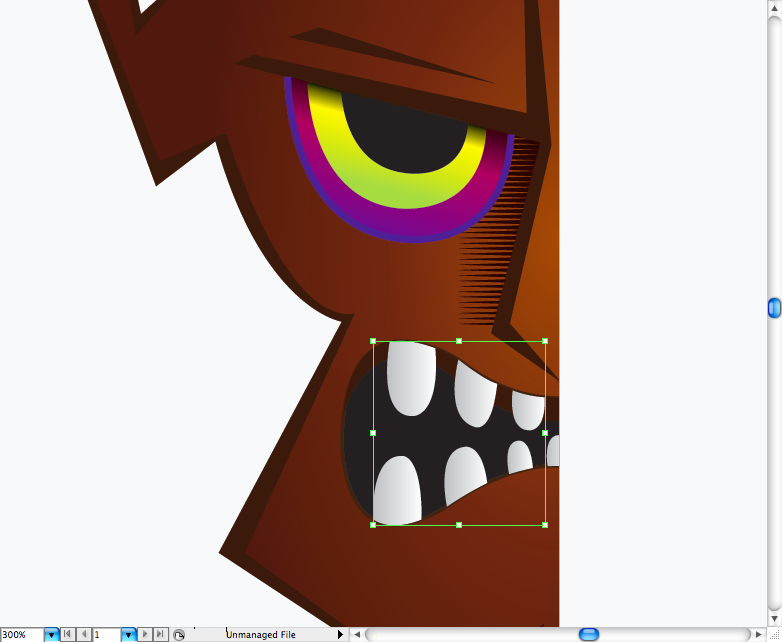
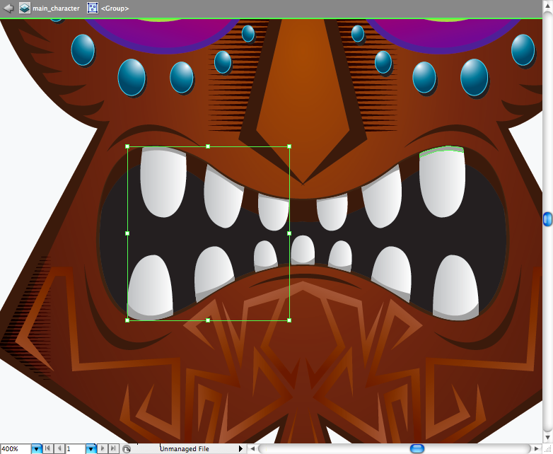
The teeth is pretty easy, just make this oval shapes with the pen tool ( P ), then add some wrinkles to the mouth.
I added some more shading to it, just make the same procedure I've explained above.
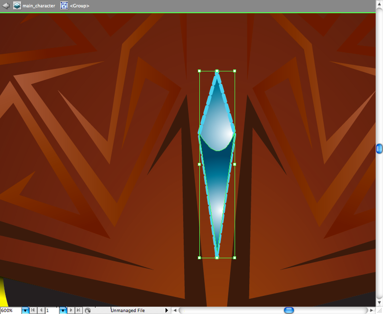
The tribal drawings are pretty easy to do, just make this sharpy shapes around the face of the mask with the pen tool ( P ) , then add a light brown gradient.
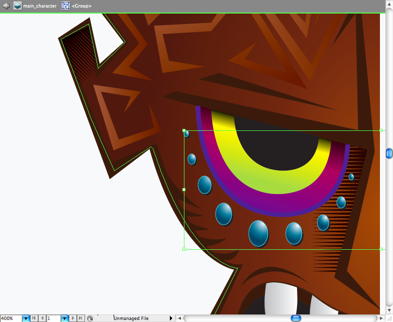
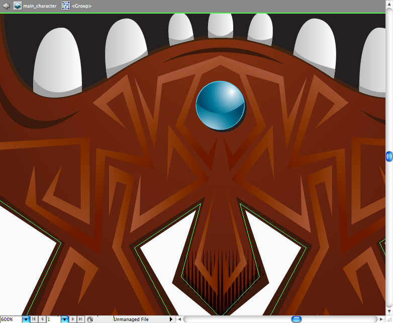
Remeber the shinning stones on the native belt? Go there get it, then just delete the half moon shape and duplicate it along the eyes.
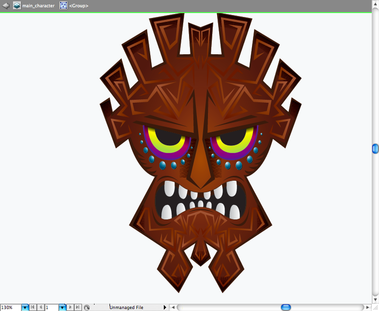
Magic trick: select all the elements, duplicate it and reflect it. Now that's a tribal mask, huh?
Using the pen tool ( P ) add some details in grey to the teeth.

Again, get the shinning stone but this time just change the color of it to a blue gradient, posicionate it right bellow the mouth. You can also make a shinning stone beetween the eyes doing the same procedure of steps ago. Then finally place it on the body we did on step 11.
The cockade is basically the leaves of the skirt larger and repeated along the mask, pretty easy to do.

Final Result
I think after all this work we must admit: illustrator is 70% pen tool, it's the best tool to make illustrations and shapes at all. So if you had some difficulty on this tutorial, i would suggest you to train more this skill, it's really important to know how to manage it. Hope you have enjoyed this time guys, see you next time.


0 comments:
Posting Komentar