


 A great technique for creating motion, mood and action in an artwork is to give the sense of a story coming to life. Although used frequently in film and books, this technique also can be applied to digital art, by using an object such as a book, painting, photograph or drawing as the focal point, and then having the composition seem to spring to life from it.
In this fantasy photomanipulation tutorial, you’ll learn how to start with just a few stock images and quickly build up an incredible story-based artwork. You’ll see how to manipulate images, add effects and build an amazing artwork in this Photoshop photomanipulation tutorial.
Let’s get started!
Step 1: Stock/scene setup and tentacle orientation
Ok to start off with we will need our base stock, the stock that everything else when be put into and that we will build upon. I choose the below stock image from Shutterstock but you can use whatever you like. The main thing to keep in mind is that you need to get something you like and that is of a decent size, mine for instance is 2000*3000.
So now we need to grab our tentacle stocks and isolate them out. I obtained my two tentacles from Shutterstock but you can get them else where or use something entirely different, in the end its going to be your piece after all!


Once you have your first tentacle (or other stock) isolated you can just drop it into your canvas as I have done here.

Next we need to switch over to our eraser tool, we want to erase all of the tentacle that is beneath the book. So press E on your keyboard and set your eraser tool up as mine is in the below screenshot and then just erase it away!


You can see I left a piece over the pages of the book, so it looks like the tentacle is pressing against the book and its skin or what have you is rolling over the edge.

Now we can do the same thing to the other side of the book.

If you would like you can now take some of the tentacles, size them down, place them like we did before and then apply a Gaussian blur with a radius of about 2. This will enhance the DOF for the book area and give the piece a little something extra.

My canvas now looks something like the below screenshot.

Step 2: Water creation
Now its time to make our book pages look like waves of the ocean… or some kind of body of water. So to start off we will switch over to our brush tool (B on your keyboard) and set it up as mine is in the below screenshot. Keep in mind that brush size will be determined by document size!
Next we can create a new layer set to overlay at 100% and paint the pages using a dark cyan/blue color.

Now we can create another new layer and draw some darker blue lines and white lines, similar to waves. Set this layers opacity to 45% and leave it as a normal layer.

Now we can start the detail work, so switch over to your 3px brush and create another new layer.

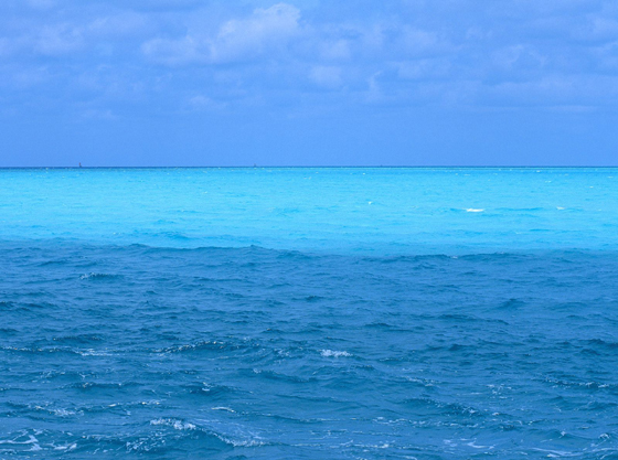
Using your 3px brush draw some crashing waves/splashing water. Think of the way the crest of an ocean looks or the way the sea foam looks as it washes onto the beach. I used a few refrence photos when doing mine, they can be found here :
- http://lifeboat.com/images/blue.ocean.jpg
- http://www.nwfsc.noaa.gov/research/divisions/fed/images/ocean_river.jpg
- http://geology.com/usgs/hawaii-volcano-pictures/lava-ocean.jpg

Now on a new layer (or if your comfortable on the existing layer) using the same brush we can begin to paint the water coming off the pages and down the back of the book. Drips like these have been covered in almost all of our tutorials here on creative fan. If you do not have any idea how to paint them yourself I suggest you head over to a tutorial located at : http://design.creativefan.com/create-a-fantastic-environmental-awareness-composition/#more-1163 It has a section dedicated to showing you how to paint a standard drip just like this.


As you can see in the below (and above) screenshot, I filled part of my water up with pure white giving the illusion of a reflection caused by a light source. This is a very good thing as it adds to the realism of the water and I would highly suggest you do it as well.

As of now my canvas looks something like the following screenshot.

Step 3: Cloud, sky and star setup
Proper cloud isolation is a key to keeping this looking good, and if you do it as I describe here its a simple technique that will look like something that took hours to complete. We will start off by going to http://www.sxc.hu/photo/1193812Once you have the cloud image go ahead and paste into your Photoshop document, I have placed another layer beneath it filled with black to ease in the isolation.

Once you have the layer in and the black layer beneath it we will go to “Select”>”Color Range”. The color range function selects a range of colors and isolates what was not selected. So once its clicked go ahead and use the eye drop tool and select the blue close to the cloud, this will select all the blues in the photo. Set the fuzziness to 200%. The fuzziness is basically the same as using something like the marquee tool with a feather option, or a soft eraser/brush on a mask layer. This prevents getting hard edges in your isolation. Make sure you check the invert box as well so that we will be selecting everything that is not blue, rather than selecting everything that is blue. Once you have everything set up as I do in the screenshot, click okay.

Now that ‘okay’ was selected, you can see that you have a nice selection around your clouds. It will look like your not getting all of the cloud selected, just the inner most cloud will look selected. But that’s ok since we have chosen to have the fuzziness set to 200%.

Now we will copy our clouds using “CTRL C”, or “Edit”>”Copy”. I choose to copy in case I make a mistake, that way I still have the original and won’t have to go looking for it again. Once you copy it hide the original layer and paste your clouds. Press “CTRL SHIFT U” or choose “Image”>”Adjustments”>”Greyscale”. This will grey scale our clouds so we don’t get any strange saturation issues later on. Also, most clouds are strictly white with only a glimmer of color anyway.
After this you can press “CTRL SHFT L” or go to “Image”>”Adjustments”>”Auto Levels”, this step isn’t necessary but it usually will create a better looking cloud. If your familiar with the level settings you can adjust them your self, for the sake of this tutorial will not go into depths about how it is used.
After the autolevels go ahead and set this layer to a “Screen” at 100%. You can see they look really rather grey in my screenshot as they will in yours, this is ok since they aren’t 100% opaque. They are showing some of the black from the layer beneath it which is exactly what we want, that way later on it will be showing the blue from our sky layers.

Once you have done that your going to want to go ahead and grab the eraser tool, set it up as a soft eraser with these settings:

We will use this eraser to clean up the edges of our clouds, which should be fairly easy to spot out on this black background. Usually the corners and sides of the document retain some strange edges so those are always a good place to start. But since this brush is not 100% opaque or hard, it will aid in creating “Fluffy” clouds, so any strange parts of the clouds you don’t like go ahead and erase them now as well.
If you have a Wacom or are just really good with a mouse, you can set the size of this brush to about 15% with a size jitter on set to brush pressure and zoom in to erase out circle motions and areas to create something that will look like “fluff marks”. If you don’t then don’t despair they aren’t as visible after we finish the piece and size it down as you would think, they become tiny details that are nice for large resolutions or prints. Once you are satisfied go ahead and delete the black layer. Now just continue on with more cloud stocks! You can find them virturally anywhere but below is a small compiled list that should help you get started!
- http://www.sxc.hu/photo/1254127
- http://www.sxc.hu/photo/1218511
- http://www.sxc.hu/photo/270213
- http://www.sxc.hu/photo/784742
- http://www.sxc.hu/photo/1175426
- http://www.sxc.hu/photo/1032898
- http://www.sxc.hu/photo/1175423
- http://www.sxc.hu/photo/956433
- http://www.sxc.hu/photo/1236129

Next we will create some ‘fog’ to go around our tentacles and our book. This is actually incredibly easy, all you need to do is grabbed a feathered selection in the clouds like I have done in the below screenshot and then just make it into a brush. Once your brush is made play around with the size, opacity and scatter jitters until you have something that suits you.

Using my brush with a faint grayish blue, followed by a plain white, I painted the below cloudy/fog arears.

Now its time to create our sky, to create the sky we first need to create a layer beneath all of our other layers except the original base stock layer. Once that is done set your brush up like mine is in the below screenshot but be sure to set your brush opacity to about 35%.

Now just paint a gradient! Fade it from the top downwards, meaning the top will be the darkest section and the as it reaches the clouds it will disappear. Take note thought, if any does go on the other side of your clouds be sure to erase it!

Now we can create a new layer above all of our layers and get started on coloring our sky. To do this grab your brush tool and select a few colors. I started off with cyan, pink, dark blue and dark violet. Then I just drew all over the sky area, applied a Gaussian blur with a radius of 250px and set the layer up as a overlay layer. However just like the last time, be sure to erase anything you don’t want, for instance I don’t want the top of my child’s head to be blue, so I erased that segment.

Now you can do this again or as many times as you like. I also used our previously created cloud/fog brush to drop in some cloud like shapes which can be seen in the below screenshot.

Once your coloring is done we can start creating our stars!
To start off go ahead and create a new layer on top of everything else and fill it with black.

Now we need to apply a noise filter which will be the base for our stars. To do this go to “Filter”>”Noise”>”Add Noise” and set yours up as mine is in the below screen shot.

Your star field should look something like the below screenshot now.

Our next step is to edit the levels for our star field. Doing this will get rid of the grey stars and help open up some negative space so they don’t look so clustered and awful. So go ahead and press “CTRL L” on your keyboard to open up your level editor and set yours up as mine is in the below screenshot. The three triangles are in order of right to left, black level, gray level and the white level. I have moved the grey level over closer to the black level. This will result in the grays becoming whiter. The white level was then moved to closer to the grey level which means the white spots have become even whiter.

Your star field should now look something like mine in the below screenshot. This could work fine, but they seem to clustered and uniformed, so lets change that.

Go ahead and click the layer mask button on your layer tab, it should look like a square with a circle in the middle. Now we can apply another filter, this time one called “Difference clouds”. Basically it will render some cloud like blobs in black and white causing our stars to only be seen where the white clouds are on the layer mask. To apply this filter click “Filter”>”Render”>”Difference clouds”. Your results should look something like the below screenshot, however keep in mind that the difference cloud filter is randomly generated.


Now you can adjust the levels and play with other filters to get something that suits you. I used a small 3px hard brush with white and painted some brighter stars to go with my noise stars. The stars I painted are the same size as my noise stars so it’s just basically putting a random dot on your canvas if you wanted to do this.
Once your star field is done merge the two layers down, set the blending mode to screen and erase anything you don’t want. For instance you don’t want stars in your clouds or on your kids head!

My document now looks something like the below screen shot.

Step 4: Stock isolation and finishing
Now its time to start adding in all of those stocks! Lets start with our jellyfish.So we can now go head over to Sxc to grab a jellyfish stock
http://www.sxc.hu/photo/843107
Now just copy this jellyfish into our document in Photoshop so we can begin editing it into our piece.

Now we can press E on the keyboard to grab the eraser tool; we will then right click and grab the standard 300px soft brush, we want to change the hardness to 100% rather than 0. Once we have our brush set up we will just quickly erase all the debris that are floating around in there with him. Try and get the strange over saturated red patches as well as all the little floating things. Once you have erased all you can see your image should look like mine below.

Now to further enhance the jellyfish we will be doing a manual edit of the levels. To do this we will need to pres CTRL L on the keyboard, we will be moving the far left triangle over to the right a little bit and then pressing ok or ENTER on the keyboard. Doing the manual adjustment will darken all the blacks in the scene and cause the grays to become pitch black which is a very good thing.

Once the levels are fully adjusted we can then change the blending mode for this layer to screen, this blending mode does not allow any black to be shown which means we are done with our isolation of the jellyfish! So just place him wherever you like and your done with him!

Now just continue dropping in more jellyfish up and in your sky as we have done previously.
Here are some jellyfish stocks to get you started :
- http://www.sxc.hu/photo/927132
- http://www.sxc.hu/photo/927134
- http://www.sxc.hu/photo/1226849
- http://www.sxc.hu/photo/234636
- http://www.sxc.hu/photo/843107

To get a multi colored jelly fish like in the below (and above screenshot) I created a new layer and just lightly painted over the jelly fish.

Now its time to add in our boats, we will start off with a boat provided by Shoofly-stock over at Deviantart. Much props to them for creating this and allowing us to use it!\
The boat can be found here : http://shoofly-stock.deviantart.com/art/Boat-Stock-34674385?q=boost%3Apopular%20in%3Aresources%20boat&qo=7

Since it’s a png render we don’t need to cut the background out, just choose which one you want to use and place it! I chose the one on the left and feathered the bottom of it using a soft eraser.

Now we can do the same thing but this time with a stock render graciously provided by DarkRiderDLMC over at DA, again, much props to them for putting this up for us to use!
This boat can be found at http://browse.deviantart.com/resources/?q=ship&order=9&offset=24#/d20bhit


Now we can add in two jets found on SXC.
http://www.sxc.hu/photo/1094062
http://www.sxc.hu/photo/1094058


Next we can add in a moon provided by EmmeKappa over at DA. Since this is on a pure black canvas we can handle the same way we did the jellyfish, just set to screen and clean it up!
http://emmekappa.deviantart.com/art/moon-4389564


Now we can add in our fishing hooks and fishing line. To do this head over to SXC and grab this stock of a fishing hook http://www.sxc.hu/photo/706123

Next just isolate it out and draw a line using the line tool, simple enough!

You can do this a few times, I think I have 3 in my piece, or you could not do it at all, its your piece!
Next we can add in our final stock, a toy hot air balloon.
http://www.sxc.hu/photo/472505
just isolate this out, remove the grassland and place!


And we are done! I added in a few birds and some drips coming off the tentacles that look like the below screen shots.


The below screenshot is my final image. I hope you enjoyed reading this tutorial and it has helped you understand a few concepts or at least showed you some techniques you did not know. If you have any questions please don’t hesitate to ask! Or if you have any tut suggestions please drop a comment, we are always looking for new concepts!


0 comments:
Posting Komentar